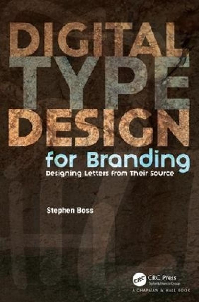
The approach will be to give visual aid (illustrated) and written reference to young designers who are either launching their careers or taking their first stab at designing letterforms for a logo, lettermark, signage, advertising or an alphabet. The book will focus on the roots of each letterform and give the designers the knowledge of why weight variations (stress) exist and how to correctly apply them to their designs.Key FeaturesA how-to resource for designers to referencee while designing letterforms.The designer will be left with a clear understanding of why letterforms look the way they do, and the moethod and order of letterform development, enabling the designer to draw on history when developing their glyphs.How-to illustrations will highlight the process and downloadable vectors will give the designer templates to begin their project.This book gives designers a solid footing when designing a series of characters without developing a complete alphabet.Custom typography is a growing trend and every newly minted designer should have a practical knowledge of the origins of letters and the method of building letterforms.
Les mer
The book will focus on the roots of each letterform and give the designers the knowledge of why weight variations (stress) exist and how to correctly apply them to their designs.
Chapter 1: A Chapter 2: B Chapter 3: C Chapter 4: D Chapter 5: E Chapter 6: F Chapter 7: GChapter 8: HChapter 9: I Chapter 10: JChapter 11: KChapter 12: LChapter 13: MChapter 14: N Chapter 15: O Chapter 16: P Chapter 17: Q Chapter 18: R Chapter 19: S Chapter 20: T Chapter 21: U Chapter 22: V Chapter 23: WChapter 24: X Chapter 25: Y Chapter 26: Z Chapter 27: Letter Frequency Chapter 28: Numerals Chapter 29: Designskolen Kolding Chapter 30: Interviews Chapter 31: Glossary and Resources Chapter 32: Bibliography
Les mer
"Probably the best biography of a cartoonist ever written, and is surely one of the best dozen or so books on comic art ever written . . . John Canemaker’s text is that great and most welcome rarity, a genuine work of scholarship about a cartoonist . . . a model for other books about comic art."-- Michael Barrier, The Comics Journal"This is one book that anyone interested in our cultural heritage can’t afford to miss."-- Art Spiegelman, USA TODAY"John Canemaker’s biography should go a long way toward putting McCay firmly back on the map . . . He satisfies your curiosity about McCay’s life, sets him in the context of his times, and comments perceptively on his art."-- John Gross, NEW YORK TIMES"At Last! Winsor McCay has found his Boswell."--Leonard Maltin, ENTERTAINMENT TONIGHT
Les mer
Produktdetaljer
ISBN
9781498777209
Publisert
2018-02-12
Utgiver
Vendor
Chapman & Hall/CRC
Vekt
362 gr
Høyde
229 mm
Bredde
152 mm
Aldersnivå
P, 06
Språk
Product language
Engelsk
Format
Product format
Heftet
Antall sider
224
Forfatter
